Bitter Sweet
Overview
Learning mixology can be exciting, but the current online drink recipes lack visual instructions, making the learning process tedious and reliant on reading. This lack of engaging experiences has failed to spark users' interest in mixology.
Process
Research to ideation
We want to explore motivations, learning experiences, and challenges in learning mixology, so that we can understand what people value about mixology and find ways to encourage motivation and improve the learning experience.
User Interviews
User needs
Users looking for interactive learning resources
Users desired for beginner-friendly learning materials
Users think hands-on practice is effective for learning mixology
75%
50%
100%
User pain points
Users face challenges with understanding technique
Users finds flavour balance is difficult to achieve
Users think unique Ingredient is difficult to find
75%
50%
75%
How might we?
How might we provide interactive and hands-on learning experiences for mixology learners to practise and refine their mixing techniques?
Ideate
With our personas and HMW statement, we can begin to ideate an interactive learning platforms that can enhance engagement, cater to different skill levels, and foster creativity in the mixology journey.
Storyboard
User journey - Persona Blake enjoys a fun and engaging learning experience using Bitter Sweet

User Flow

Task Flows
Learn how to make cocktails
Practice making cocktails
Sign-up for an account

Lo-fi Wireframe
Key screens for Home, Learn and Challenge page

Digital Wireframe
More details including UI components, Font size were developed for each section in mid-fi wireframes

UI & Branding
The lime tone connects with the mixology interest, creating a joyful and welcoming vibe that motivates users to explore the platform.

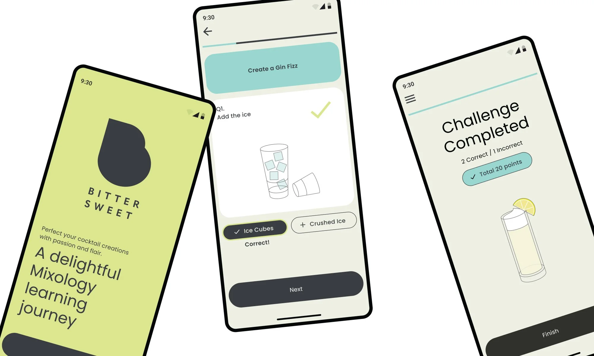
Prototype
Key screens for Task Flow 1:
Sign-in and view the learning status

Usability Testing
Task
Sign-up and check learning progress
Learn a cocktail recipe
Practice by taking a challenge
Results
Task completion
No errors
User Satisfaction
The overall experience has met the users expectations, and a few things need improvements
Most users find learning experience easy to understand, and think that this is an effective way of learning
Most users fail to navigate from Home to ‘Learn’ and ‘Challenge’ page
Users expect more interactions and images to make practising more engaging.
PRIORITY REVISIONS
Success Metrics
‘Learn’ and ‘Challenge’ needs to be more accessible
Menu/Back icons more visible
More interactions, visuals and icons to create a more engaging learning experience
In ‘Challenge’ section, more support and clues for beginner
Iterations
Task Flow 2
- ‘Learn’ page needs to be more accessible
- Menu/Back icons more visible
- More interactions, visuals and icons

Task Flow 3
- ‘Challenge’ page needs to be more accessible
- Menu/Back icons more visible
- More interactions, visuals and icons
- More support and clues for beginner

Key Learnings
User-Centric Approach: Prioritize user needs and preferences for optimal experiences.
Research Insights: Gather user data to inform design decisions.
Information Architecture: Organize content for intuitive navigation.
Visual Consistency: Maintain design harmony and branding coherence.
Prototyping: Test ideas and iterate for user-friendly solutions.
Accessibility: Inclusive design ensures usability for all users.
Usability Testing: Evaluate and improve designs through user interactions.